We are pleased to launch our new website and logo after months of joint conceptualisation with our members and implementation!
The aim was to have a clearer website that reflects our strategy and makes information easy to find, as well as a logo that strengthens and highlights RECI’s network identity.
Why a new website?
RECI is the hub for Swiss expertise in education and international cooperation. Our mission is to promote mutual learning, jointly develop new approaches and tools, and make this expertise accessible worldwide.
RECI needs visibility and clarity to reach its diverse target audience. The website is at the heart of our internal and external communication. In an internal evaluation, members expressed that our previous website was not clear enough. It was difficult to find specific information in the wealth of information that had built up over the years. It also came out that the visual identity no longer represented RECI’s values, purpose and identity well.
We hope that the new website will explain the versatility of our network and its activities in an understandable way, and that it will make the rich topics and content from the past and coming years accessible in a clear way.
We are aware that there are still some changes to be made. Please bear with us and help us improve the site by sending us your comments and suggestions (email : info@reci-educatin.ch).
The meaning of the new logo
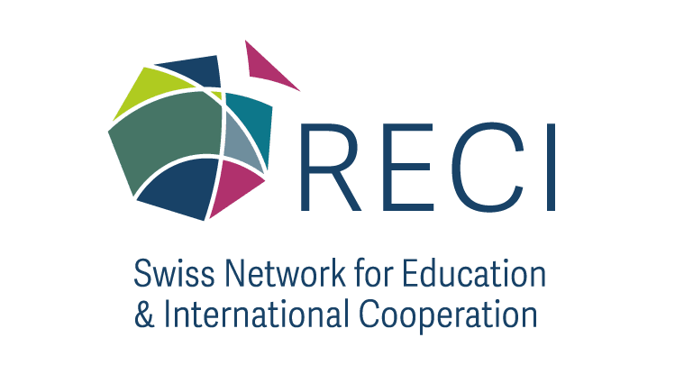
The new RECI logo has a hexagonal, rounded shape. It symbolises the network and the community which, like a ball in constant motion, brings progress and development. RECI members are illustrated by all kinds of triangles in different sizes, shapes and colours. These symbolise the diversity and variety of the members. The hexagon is not closed, but open to new members, like the detached triangle, which welcomes new members to join the network.
The colour green was adopted from the former logo. With this we express that the new strategy is built on a solid foundation…. The new colours symbolise new aspects and innovations of the new strategy.
We are also working on a new newsletter which will be distributed in three languages; French, German and English! You can now subscribe to the newsletter in English.


